
Probably not, at least not in the way the question is usually meant. When researchers have measured reading performance directly, light mode has generally beaten dark mode rather than the reverse, and the studies that also measured how people’s eyes felt afterwards have mostly found no meaningful difference between the two. So the honest answer to “does dark mode reduce eye strain” is that dark mode appears to change how well you read more reliably than it changes how tired your eyes get.
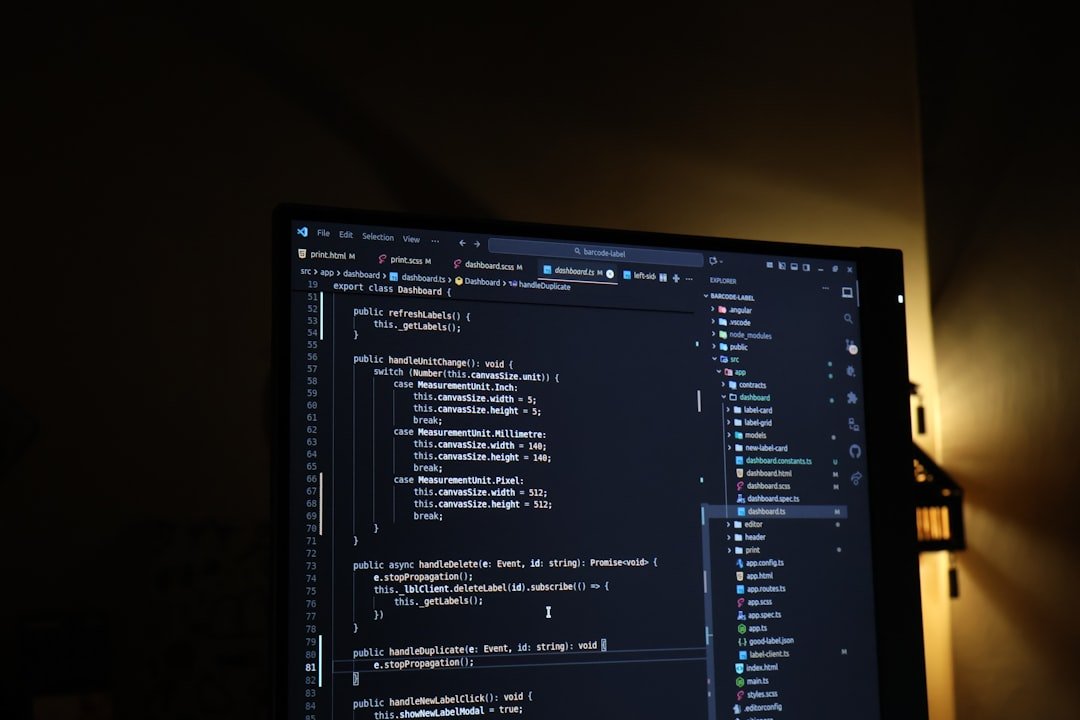
Consider where the question usually comes from. Editor dark, terminal dark, browser extension forcing dark onto every site that dares ship white. It would be convenient if the setup that feels gentler also tested better. It mostly does not, and the reason is more interesting than the verdict.
What the polarity research actually measured
The vocabulary matters, because the research does not use the phrase “dark mode”. Vision scientists call dark text on a light background positive polarity and light text on a dark background negative polarity. Dark mode is negative polarity, studied under that name since the CRT era.
The most careful adult test is a 2013 study in Ergonomics by Piepenbrock and colleagues. They ran 85 older adults (60 to 85) and 84 younger adults (18 to 33) through a visual acuity test and a proofreading task on an LCD, assigning each participant to one polarity only, so that nobody could quietly compensate by trying harder in the harder condition. Positive polarity won in both age groups on both measures, and the authors recommended it regardless of the reader’s age.
A follow-up the next year in Human Factors added text size to the design, running the same kind of proofreading task at 8, 10, 12 and 14 point. The positive polarity advantage appeared again, and it grew in a straight line as the characters got smaller. The authors’ applied recommendation was to avoid negative polarity displays particularly at small font sizes.
Now the part that tends to get dropped in summaries. The 2013 study also asked participants to rate eyestrain, headache, muscle strain and back pain before and after the session. Across eighteen tests on those measures, exactly one came out significant, and the authors judged it probably chance. Reading performance differed by polarity. Reported discomfort did not.
Why the light background wins

The explanation the researchers favour has nothing to do with colour. It is about luminance. A screen of dark text on white is simply brighter overall than white text on black. A brighter display constricts the pupil, and a smaller pupil reduces the effect of optical aberrations and increases depth of field, which sharpens the image landing on the retina.
The evidence for that is direct. The 2013 paper reports that an earlier experiment by the same group compared the two polarities at equal overall luminance, and the positive polarity advantage in proofreading disappeared. Brightness was doing the work, not polarity as such. (That earlier result is cited here as the 2013 paper describes it, not from the original.)
It is also why the 2013 study carries a limitation the authors state themselves: ambient illumination at the participants’ eye position was more than thirty times higher in the positive polarity condition, because the bright screen was lighting the room. Polarity and room brightness moved together. That is how it works at your desk too, but it means the experiment is not a clean test of polarity in isolation.
Where dark mode holds up
Two things, and they are not nothing.
First, performance and comfort are separate measurements, and the studies that went looking for symptoms have not found light mode better. A 2025 crossover experiment had 30 female tablet users, average age 21, spend an hour reading and gaming in each mode, with visual fatigue, dry eye and critical flicker frequency measured before and after. Self-reported visual fatigue rose significantly after an hour in both modes, and the difference between the modes was not significant. Dry eye scores did differ significantly between the modes, with the smaller increase in dark mode, though only just (p = 0.048).
That study is small and narrow: 30 participants, all female, all with 20/20 vision, aged 18 to 25, on a tablet, for one hour, in a room held at a controlled light level. Its authors flag the sex and vision restrictions themselves. It is also internally inconsistent about which mode comes off better, so treat it as a weak signal rather than a result to build on.
Second, for some eyes the advantage genuinely reverses. The 2013 paper cites earlier work in which low-vision observers with cloudy ocular media, meaning corneal scattering, cataract or vitreous debris, read light-on-dark text roughly 10 to 15 per cent better. Piepenbrock and colleagues excluded people with macular degeneration, clinically relevant cataract, glaucoma, diabetic retinopathy and uveitis from their sample, so their all-ages recommendation covers eyes without those conditions.
What the evidence says does reduce eye strain
Here the frame shifts. A 2018 review in BMJ Open Ophthalmology covering the prevalence, measurement and management of digital eye strain puts prevalence at 50 per cent or more among computer users, and splits the symptoms into two families: external ones linked to dry eye, and internal ones linked to refractive error, accommodation or vergence.
Its conclusion contains the sentence worth pinning above the monitor. The accommodative and vergence problems that show up during computer work appear to be a consequence of demanding near work, rather than of screen use as such.
The review identifies three levers, none of which is a theme setting.
Correcting refractive error. Uncorrected astigmatism is singled out. The review reports that double-masked randomised studies found even 0.50 to 1.00 dioptres of simulated uncorrected astigmatism worsened subjective visual comfort, and that 1.00 to 2.00 dioptres may increase task errors by up to 370 per cent and substantially reduce productivity. Note the hedge: that figure is an upper bound the review reports, not a typical effect.
Breaks. The review notes that the American Optometric Association promotes the 20-20-20 rule, a 20 second break every 20 minutes spent looking at something around 20 feet away, and reports that frequent short breaks can relax accommodative and vergence responses and reduce symptoms without costing productivity.
Dry eye. Blink rate falls during screen work. The review cites a 1991 study measuring about 18 blinks per minute before computer use, dropping to under 4 during it. The review is careful here, and so should anyone quoting it be: it suggests modern displays may be closer to print than older ones, so the dramatic historical drops may not describe current conditions. It also reports a study where cognitive demand affected blink rate more than whether the text was on a tablet or on paper, which again points at the near work rather than the pixels.
If your eyes ache most days, if your distance vision blurs after screen work, or if headaches cluster at the end of the working day, an eye examination is a better use of an afternoon than another theme. The review is explicit that correcting refractive error and presbyopia is an accepted intervention for digital eye strain. Persistent symptoms belong with an optometrist or ophthalmologist, not a config file.
Common questions
Is dark mode better in a dark room?
The polarity research does not settle this, and the main study cannot. In the 2013 Ergonomics experiment, ambient illumination at eye level was more than thirty times higher in the light mode condition, because the bright screen lit the room. Polarity and ambient light were confounded by design. Light mode still won on both measures there, but if you work in the dark, treat that as suggestive rather than settled. What the evidence does support more broadly is that measured eye fatigue rose after an hour of screen use regardless of mode in the 2025 tablet study, so session length is doing work that the theme is not.
I have astigmatism. Does dark mode help?
There is no evidence that a theme substitutes for correction. The 2018 BMJ Open Ophthalmology review reports that double-masked randomised studies found even 0.50 to 1.00 dioptres of uncorrected simulated astigmatism worsened subjective visual comfort, and that 1.00 to 2.00 dioptres may increase task errors by up to 370 per cent, an upper bound rather than a typical effect. Correcting refractive error is listed there as an accepted intervention for digital eye strain. If you have astigmatism and your eyes hurt at a screen, see an optometrist or ophthalmologist before touching your colour scheme.
If light mode tests better, why does dark mode feel better?
Because the studies measured two different things and got two different answers. In the 2013 Ergonomics experiment, proofreading and visual acuity were better in light mode, while self-rated eyestrain, headache and muscle strain showed essentially no polarity effect across eighteen tests. In the 2025 tablet crossover study of 30 young women, self-reported visual fatigue after an hour did not differ significantly between modes. So “performs worse” and “feels worse” are separate claims, and the evidence supports the first far better than the second. Our own reading, rather than a study finding: a brighter screen constricting your pupil improves image sharpness, and there is no particular reason that should feel like anything.
Does font size change the answer?
Yes, and this is the most actionable finding in the literature. The 2014 Human Factors study ran proofreading at 8, 10, 12 and 14 point and found the light mode advantage increased linearly as characters got smaller, with the authors recommending that dark backgrounds be avoided particularly at small font sizes. That is a finding about legibility, not about symptoms. Our inference rather than the study’s conclusion: if you are attached to your dark theme, bumping the font size is a cheaper concession than switching it.
The dial you are actually turning
The question sets dark mode and light mode up as a health decision. The research keeps answering a narrower one: which background lets you find a typo faster. Those are different questions, and the evidence for the health version is thin in both directions.
The theme is a small dial on a machine with much larger ones. An hour of continuous near work raised measured fatigue whichever mode people used. Uncorrected refractive error has a documented effect on comfort and error rates. Short frequent breaks reduce symptoms without costing productivity. None of those care what colour your background is.
So keep the theme you will actually keep, size the text so you are not squinting at 8 point, and spend the attention you were going to spend on this argument on an eye test and a break timer instead. (For the related question of whether tinted lenses help, see what the evidence says about blue light glasses.)
Did this answer your question?
Thanks. That helps us decide what to fix.


Leave a comment